Scanning
The first step in digital editing is to scan your art in. Obviously how you do this depends on which scanner you have. Whatever the type, a scanner will have a particular software that allows you to select mode (grayscale, color, etc.), dpi, and so on. The type of parameters you'll want depend on what sort of processing you want to do, and what kind of an image you're starting with. For pencils, you'll need to use grayscale. Obviously, a color image will need to be scanned in color. For comics (in ink), I highly reccommend scanning in black and white mode at a high resolution, then changing to grayscale for processing and shrinking it back down when you're done. The reason is that selection becomes very easy when your lines are very distinct. Also, noise and dirt won't come through like they would in grayscale, although you could just get rid of that with the levels feature (more on that later). Some scanners, however, don't have good recognition of very thin lines, and if you try to scan in b+w mode, your lines will be discontinuous. My own, a Canon LiDE 20, has this problem, so I have to use grayscale.
Brightness and Contrast
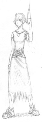
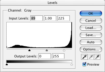
| Usually when we scan an image in grayscale, there are issues with the contrast: dirt on the paper will be showing through, the lines won't be dark enough, etc. To correct these problems, we use the Image > Adjustments > Levels feature. (Select "Levels" from the Adjustments submenu, which is in the Image menu.) The dialogue box is shown below. The part we're interested in is the "input levels" histogram, and the three sliders. The three sliders, from left to right, correspond to black, gray, and white, respectively. The x-axis of the histogram refers to a grayscale value, with black on the left and white on the right. The y-axis represents the number of pixels that have that grayscale value. For this tutorial, we'll consider a random pencil image, shown as-scanned to the right. |
 |
 |
Changing the levels changes the grayscale value that will be assigned to each pixel, based on the value that pixel had originally. The sliders on the input levels histogram set maximum and minimum grayscale values. For example, everything to the left of the black slider will be considered completely black in the new image. Likewise, anything to the right of the white slider will be considered completely white.
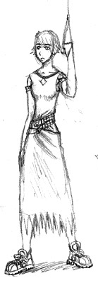
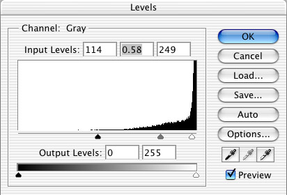
| I can explain more, but it's best to just see it. If you look at the dialogue box below and at the image to the right, you can see what I did and how it affected our image. Looks better, right? For how, look at the histogram. See how the black and the white sliders are moved toward the middle? That causes all the lightest grays to disappear, and the darker grays to be black. The biggest effect though, is from the gray slider. By moving it to the right, all the grays become darker. This slider is more difficult to explain. If you have photoshop, just play around with it a bit. If you don't, there's not much point in reading this, is there? |
 |
 |
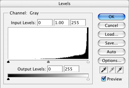
Looking at the histogram will tell you a little about what you should do to optimize your contrast. In the example above, look at the big peak at the far right of the histogram. This represents all the negative space of the image: the paper, in other words. Because the paper isn't really pure white, the scanner represents it as a lot of very light grays. We want the negative space in our image to be pure white (usually), because it looks better, and because the filesize will be inflated if we try to keep all those paper grays. So, I moved the white slider to the left of the "paper peak". The rest of the grays on the histogram represent pencils.
 |
Now, here's a random ink image. Look at the histogram for this one. The big difference here is that we have two peaks now. The one to the left, which represents the darker peak, is the ink peak. It's much smaler than the paper peak, because the ink is covering a relatively small amount of the paper in this case. For this image, handling the levels is easier. We want our sliders to be between the two peaks, so all our ink lines are completely black, and all the paper is completely white. If you'll notice, there're some gray values between the two peaks, and the peaks aren't as distinct as they could be. This is due to the paper being dirty, and the ink being spread thin in some places. For comics, at least, you usually want to try to make those peaks as distinct as possible. |
 |